Css documentation
Introduction to CSS
The three pillars of writing good CSS
- Responsive design
- Fluid layouts
- Media queries
- Responsive images
- Correct units
- Desktop first vs mobile first
- Maintainable & scalable code
- Clean
- Reusable
- How to organize files
- How to name classes
- How to structure HTML
- Web performance
- Less http requests
- Less code
- Compress code
- Use a CSS pre‐processor
- Less images
- Compress images
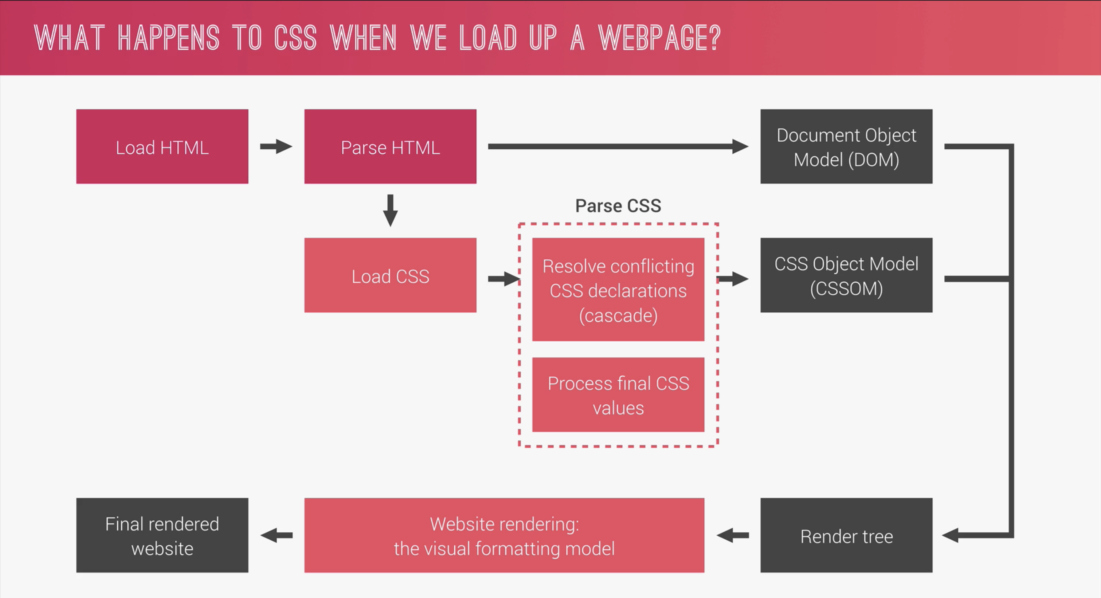
What happens when we load a webpage?
Linking Stylesheets
Link stylesheets with the link element.
                    <link rel="stylesheet" href
                    ="style.css">
The order of the Cascade
CSS is declared from the top down, anything declared further down the CSS that clashes will win! If we have multiple CSS files, the order they are linked in the HTML file matters, the first linked CSS will be declared, then the 2nd and so on!
CSS Architecture
- Think
- Think about the layout of the webpage before coding.
- Build
- Build the layout with a consistent structure of naming classes
- BEM structure as seen below
- Architect
- Create a logical folder acrhitecture for the project
- The 7‐1 pattern = 7 different folders for partial SASS files & 1 main SASS
file to import all other files into a compiled CSS stylesheet, the 7 folders are;
- base/ (basic project definitions)
- components/ (1 file for each component)
- layout/ (define overall layout of project)
- pages/ (styles for specific pages)
- themes/ (to implement different visual themes)
- abstracts/ (code that does not output any css such as variables or mixins)
- vendors/ (where all 3rd party css goes)
How to name classes using BEM (Block Element Modifier)
- .block
- .block__element
- .block__element--modifier
                    .hero

                    .hero__btn

                    .hero__btn--round
CSS Selectors
- Universal selector, * Select everything in the document. Not very commonly used.
- Element selector, button Select all of a certain element for example, all buttons.
- Selector list, h1, h2 Select all h1's and h2's.
- Decendant selector ol li Select all li's that are nested inside of all ol's. They don't have to be direct decendants to work.
- Adjacent selector, h1 + p Selects all the paragraphs that come immediately after a h1 at the same level, not nested.
- Direct child selector div > li Selects all li's that are a direct child to a div. (One level down).
- Attribute selector input [type="text"] Selects all text inputs. This can select any attribute.
- Class attribute selector section.post Selects sections with the class of post.
- Other attribute selector a [href^=example] Starts. a [href*=example] Containing. a [href$=example] Ending.
Psuedo Classes
Psuedo classes selects the whole element and starts with a :
- :nth‐of‐type(2) Selects just the 2nd element.
- :nth‐of‐type(2n) Selects every 2nd element.
- :nth‐of‐type(even) Selects every even numbered element.
- :nth‐of‐type(odd) Selects every odd numbered element.
- :link to design links in the unvisited state (before they are clicked)
- :visited to design links in the visited state always use this even if the visited state will look the same as default state
- :not(:last‐child) selects everything except the last child, can swap last child out for any other psuedo class.
Psuedo Elements
Psuedo elements select part of an element and starts with ::
- ::first‐letter(2) Selects first letter of the element.
- ::after to add something after an element, such as adding an arrow to a link on hover. Need to add a content property & display property.
CSS Specificity
The more specific selector wins.
Sepcificity order is as follows;
- !important declaration Never use!
- Inline Styles Never use!
- ID
- Class
- Element
CSS Inheritance
Elements, if styles not specifically set, will inherit styles from the closest selector such as body or div etc.
Some elements do not inherit styes such as inputs and buttons but you can declare them to inherit styles in stylesheet, for example, color: inherit;
You can set an element to inherit a value by declaring the inherit property.
You can set an element to inherit the initial value by declaring the intial property.
CSS box model
Width & height
width & height properties set the width and height of the content area, but if box-sizing is set to border-box, it sets the width of the border area.
Margin
By default, body has a margin of 8px, common to set body margin to 0 at top of css. This can also be done with normalize.css or reset.css
Inline & Block
Inline
- Width and heigh properties are ignored
- Horizontal margin and padding respected, vertical is ignored.
Block
- Width & height properties are respected
- Margin & padding are respected
Inline-Block
Works as an inline element BUT width height margin and padding are all respected.
How to easily center elements inside the box
                    .class name {

                        position:
                            absolute;

                        top: 50%;

                        left: 50%;

                        transform: translate(
                            -50%, -50%);

                        }
- We need to set the parent containers postion to position: relative;
- The transform property moves the center point from the top left of the box by default to the center of the box using the x & y axis (-50%, -50%)
Measurements Units
Ems
ems are relative to the size of the parent element. For example, if sections font size is 16px, if font size for p inside the sections is set to 2em, that would equal 32px (twice the sections font size).
Rems
rems are relevant to the root HTMLs element font-size. For example, if root font-size is 20px, 1rem = 20px
Change root HTML element font-size by targeting html in CSS.
Tip!
Good practice is to set the root font‐size to 62.5% (10px) and replace all pixel measurements to rems for everything, not just font‐size as this makes it easier for us during responsive design.
It is bad practice to set root font‐size to pixels as people with visual issues cannot change the root size in their browser, so setting percentage of the default browser root font‐size allows users to still change the root font‐size in their browser.
Other CSS elements
Functions
- width: calc((100% ‐ 80px) / 2); The calc function can do math using multiple units.
Opacity & rgba
- rbga only effects background elements.
- opacity effects all elements.
Position property
Sets how the element is positioned in the document.
- static How the element is positioned by default, not effected by top left right and bottom properties.
- relative How the element is positioned in the document, like static, but we can offset it relative to its default position using top left right and bottom properties.
- absolute The element is removed from the document flow and no space is created for the element. If this is not nested inside of a positioned element, it will be positioned relative to the body. To fix the issue of the element being taken out of the document flow, there is no clearfix method like there is with floats, instead we need to declare the height on the parent element (where we delcared the position:relative)
- fixed The element is removed from the document flow and no space is created for the element. It will be positioned relative to the body and fixed when scrolling.
- sticky Element positioned according to document flow, but once it hits the top of page when scrolling, it will stick there.
CSS Transitions
transition property allows you to transition between states such as default to hover, the following properties accepted are
- property name such as background‐color
- duration such as 1s
- timing function such as ease‐in
- delay such as 1s
                    transition: background‐color 1s
                        ease‐in 1s;
CSS Transform
These properties are used to rotate, move or scale elements.
- transform: rotate(); rotates x degrees.
- transform: scale(0.5); scales down to half its size.
- transform: translateX(200px); moves sideways 200px.
Fonts
When linking fonts, make sure to add the link before the linked CSS in the HTML document.
                    <link  href
                    ="font link" rel="stylesheet">
                    <link rel="stylesheet" href
                    ="style.css">
Designing Image elements
- background‐image: linear‐gradient(to right bottom, rgba(126, 213, 111, 0.8), rgba(40, 180, 131, 0.8)), url(../img/...jpeg); sets background overlay & background image. background overlay should always be stated before the background image.
- background‐size: cover; sets if the image should contain, cover etc
- background‐position: top; sets the initial position of the image
- clip‐path: polygon(0 0, 100% 0, 100% 75vh, 0 100%) clip path creates shape dividers. the polygon property defines the four corners of the images starting from top right going clockwise defining the x and y cordinates.
- CSS clip path maker
CSS Flexbox
What is Flexbox?
Flexbox allows us to distribute elements a certain way within the container which makes responsive design easier.
Flexbox is used to create flexible layouts.
Flexbox cheatsheet
Check out this cheatsheet for flexboxFlexbox properties;
- display: flex; sets container to use flexbox.
- Main axis - the direction the elements are set to
- Cross axis - the spacing between each row or column
- flex‐direction allows us to decide main axis direction.
- justify‐content determines how elements are distrubited across the main axis.
- flex‐wrap determines if elements should wrap onto a new line when overflowing.
- align‐items determines how elements are distrubited across the cross axis.
- align‐content the space between the rows or columns. Only with flex-wrap on.
- align‐self similar to align-content except we add this to a single element to align individual elements instead of every element in the container.
- flex‐basis sets height (column) or width (row) of all elements depending on if flex-direction is set to row or column.
- flex‐grow controls the amount of space elements take up, if there are extra amounts of space. (Makes elements grow for larger screens, good for responsiveness.)
- flex‐shrink controls the rate elements shrink, if there is too little space. (Makes elements shrink for smaller screens, good for responsiveness.)
Float & clear method
                    parent‐element::after {

                        content:
                            "";

                        clear: both;

                        display:
                            table;

                        }


                        .navigation {

                        list‐style:
                            none;

                        float:
                            left;

                        }
Responsive Designs & Media Queries
- media queries also accept orientation (landscape or portrait) as well as min‐width and max‐width
- To set a media query for touch devices, you can set media query to hover: none
Responsive images in html
Responsive images relates to which size of an image we should deliver depending on screen size etc. The 3 use cases are;
- Resolution switching Decreasing the image resolution for smaller screens
- Density switching Decreasing the image resolution for lower resolution screens
- Art direction When you want to serve a whole different image for a different sreen size
For normal images, you change in html, for background images, you need to change this in the css.
Example below is density switching using srcset instead of src allows you to add more than 1 image, then adding 1x and 2x after each image file tells the web browser which image is for low res screens and high res screens. 1x is for low res screens and 2x is for high res screens.
                    <img srcset="img/logo-green-1x.png 1x, img/logo-green-2x.png 2x"
                        src="img/logo-green-2x.png">
Example below is art direction We use the picture element instead of the img element. We then select the default image using the img element. We also set a source element and within that, we specify that at a below screen width size, we display a different image, in the example below, on mobile, we display a different logo.
                    <picture>

                        <source srcset="img/logo-green-small-1x.png 1x,
                        img/logo-green-small-2x.png 2x" media="(max-width:
                        37.5em)">

                        <img srcset="img/logo-green-1x.png 1x, img/logo-green-2x.png 2x"
                        src="img/logo-green-2x.png">

                        </picture>
Example below is resolution switching We use the srcset attribute to list the different sized images using a width identifier to let the browser know the width of each image. Then we use the sizes attribute to tell the browser how wide the image should be on different screen sizes as the example below shows, 20% on screens with a max-width of 900px or 30% width on screens with a max-width of 600px. We then also set the default width of 300px for the other screen sizes. Finally we add the src attribute as a backup for old browsers.
                    <img srcset="img/nat-1.jpg 300w, img/nat-1-large.jpg 1000w"

                        sizes="(max-width: 900px) 20vw, (max-width:
                        600px) 30vw, 300px">

                        src="img/nat-1-large.jpg">
Responsive images in css
We use css to change the responsiveness of background images. The example below show how we can use media queries to change the background image if the screen resolution is above 192dpi (apples retina display resolution) and a screen size above 600px in width (larger than mobiles) OR if the screen size is above 2000px wide. In the below example, we use a higher resolution image on screens that are larger than mobile with high resolution.
                    @media (min-resolution: 192dpi) and @media (min-width: 37.5em),

                            (min-width: 125em) {

                            background-image:
                                linear-gradient(to right bottom,

                             rgba ($color-primary-light, 0.8),

                             rgba ($color-primary-dark, 0.8)),

                             url (../img/hero.jpg),

                            }
Normalize CSS
Different browsers have different padding, margins etc by default, Normalize.css normalizes the default browser settings so your css would be the same on every browser.
Download normalize.css hereHow to do a custom CSS reset with the universal selector (*)
                    *,
*::before,
*::after
                        {

                        margin: 0;

                        padding: 0;

                        box‐sizing:
                            inherit;

                        }


                        html {

                        font‐size:
                            62.5%;

                        }


                        body {

                        font‐family:
                            "Lato", san‐serif;

                        font‐weight:
                            400;

                        font‐size:
                            1.6rem;

                        line‐height:
                            1.7;

                        color:
                            #777;

                        box‐sizing:
                        border‐box;

                        }
You add the font properties in the body element so all of the child elements of the body can inherit the font styles.
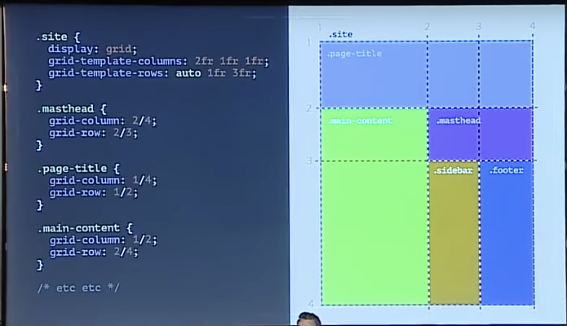
CSS grid
CSS grid is a new grid layout made in CSS without external frameworks like Bootstrap.
- grid‐container any container in the document that I want to add a grid inside. display: grid;
- grid‐item any direct descendant of a grid container.
- grid‐line any horizontal or vertical lines inside the grid separating the sections. Lines are numbered. Top left point of grid is 1/1.
- grid‐cell any cell inside a grid.
- grid‐track space between 2 or more lines. (space between rows or columns.)
- grid‐area a defined rectangular area inside the grid that covers more than one cell.
- grid‐gap Empty space between the grid tracks. (padding around the grid lines.)
- justify‐items and align‐items applied to grid container - Align the elements horizontally or vertically.
- justify‐self and align‐self applied to element - Align the elements horizontally or vertically.
Css grid cheatsheet
Check out this cheatsheet for css gridsHow to use a grid;
- Declare a grid on a container using display: grid;
- Decide how many columns and rows we want grid‐template‐rows or grid‐template‐columns: 1fr 2fr 1fr; auto will define size based on content inside to fit.
- Declare where to place each element grid‐column: 2/4 (from column line 2 to column line 4) grid‐row: 2/3 (from row 2 to row 3).
Tip!
If you want to use 3 equally sized columns or grids, state grid‐template‐columns: repeat(auto‐fill, minmax(300px,1fr)) You can also set a minimum and maximum size of rows or columns with minmax
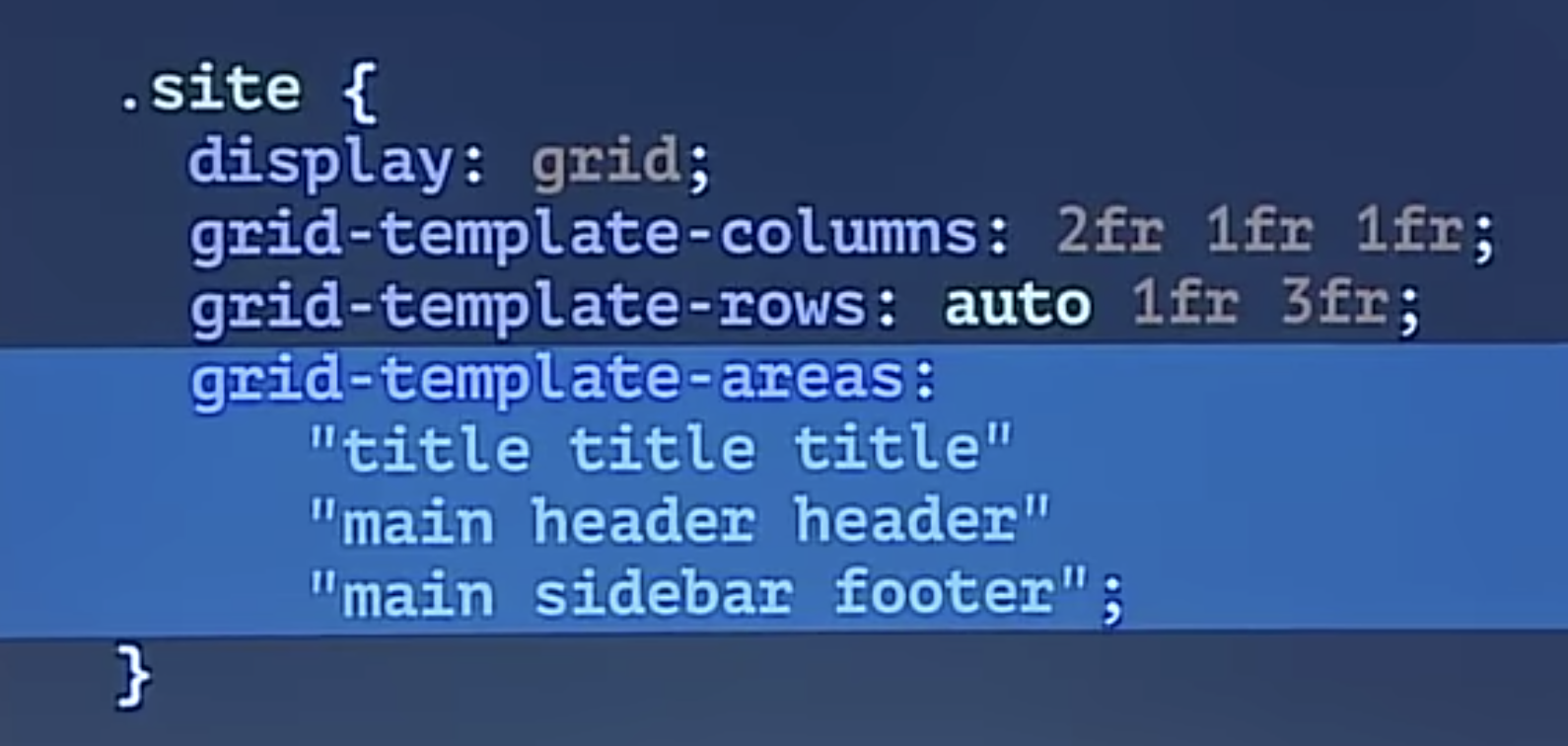
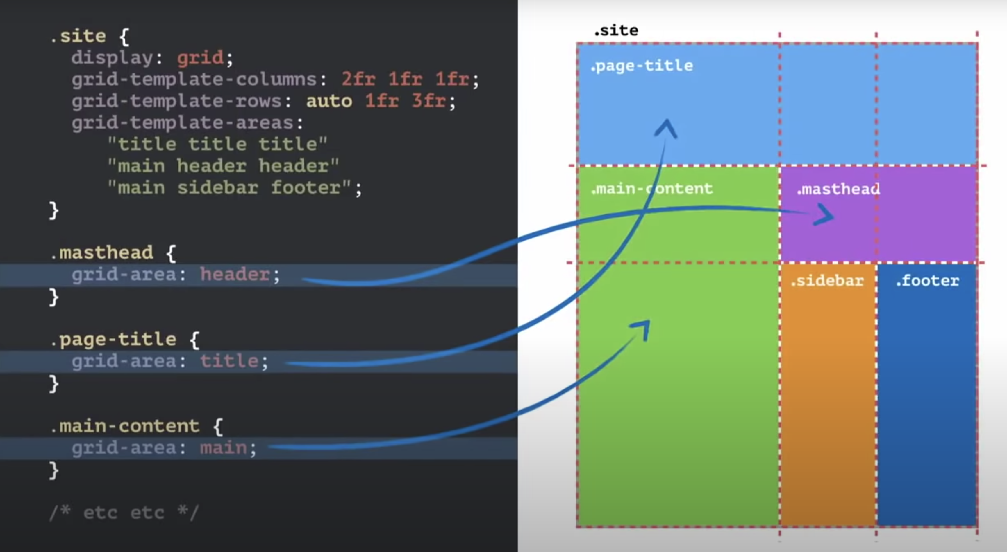
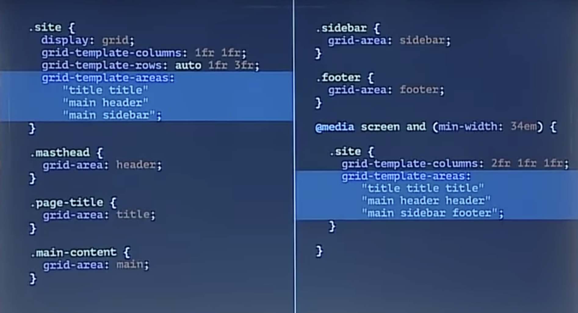
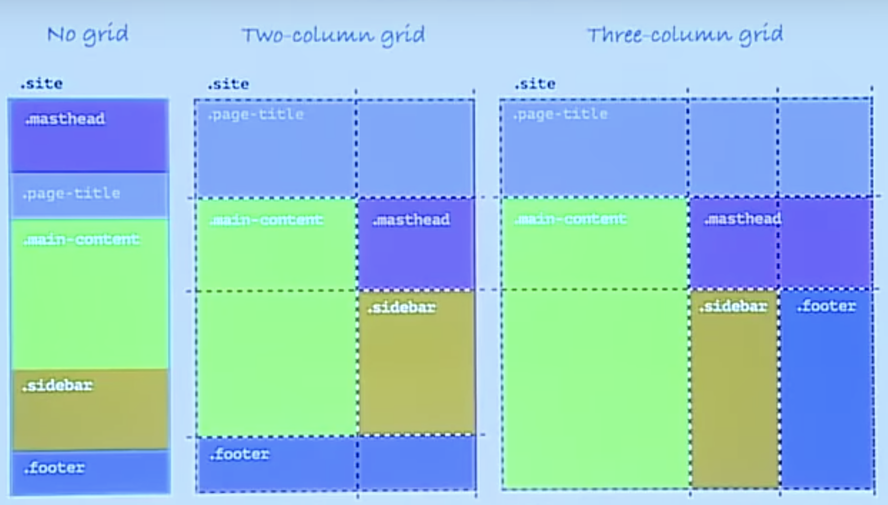
You can use grid‐template‐areas and grid‐area to place things in the grid without needing to remember line numbers.
- grid‐template‐areas applied to grid container. Uses text-based grid map to apply grid area names to individual cells. Write out each cell of the grid , visually.
- grid‐area applied to elements. Specifies what area the element should be placed in.
To make responsive design, in media queries, just declare new grid‐template‐rows, grid‐template‐columns and grid‐template‐areas Move the names around in the grid.
Nested Grids
You can create nested grids to create layouts within sections.
Practical approach to CSS Grid
- Build an accessbile mobile first website without CSS Grid.
- Use mobile first layout as the fallback for all browsers.
- Use @support to detect grid support on browser.
- At appropriate breakpoints, create layouts with CSS grids and grid-areas.
Use firefox inspect tools to inspect the grid.
Learn more at Grid By Example.
Css animations
                    @keyframes moveInLeft {

                        @0% {

                        opacity: 0;

                        transform:
                            translatex(-100px);

                        }


                        @80% {

                        transform:
                            translatex(10px);

                        }


                        @100% {

                        opacity: 1;

                        transform:
                            translate(0);

                        }


                        }


                        .className {

                        animation: moveInLeft
                            1s
                            ease‐out;

                        }
- Set keyframes using the @keyframes (name the animation)
- Call the animation in an element using the animation property.
- If we get weird glitching in the animation, go to the parents container element and input backface‐visibility: hidden;
- When using a delay, set animation-fill-mode: backwards; so element is invisible before animating in.
Browser support
For new css properties, we can use the @support query to say, if the css property is supported by the browser, then add these rules. See below for example.
                    @supports (‐webkit‐backdrop‐filter:
                            blur(10px)) or
                            (backdrop‐filter:
                                blur(10px)) {

                            -webkit-backdrop-filter:
                                blur(10px);

                            backdrop-filter:
                                blur(10px);

                            }
Custom properties (Css variables)
Css custom properties are variables we can use natively in css.
- Custom properities need to be declared in a declaration block in the :root pseudo class.
- They are cascaded and inherited like normal css
                    :root {

                    --color-primary:
                        #eb2f64;

                    }


                    body {

                    color:
                        var(--color-primary);

                    }
Introduction to Bootstrap
Installing Boostrap
2 options, add CDN, or download files and link the css files. Then add the JS script tags to the bottom of the body right before the closing body tag. JS Scripts are needed for some Bootstrap components, see the list here.
Basic Components
- .container responsive container with some padding, used on divs.
- .container‐fluid responsive containers that span across the full width of the screen.
- .container‐m responsive container that goes full width until hitting medium break point then had padding on the sides.